 At the very thought of the phrase ‘Web Design Trends’, people can instantly form a link with visuals from back in the day when the internet was just a fledgling thing. All those shiny buttons, HTML based websites, and the GIFs that made up the websites in the days gone by might make you cringe right now. It was these design elements which made up the bulk of the design trends in that time.
There have been drastic trends when it comes to web design but the last decade or so has seen more subtle changes in terms of how it’s done. As subtle as they may be, it is still an important thing to be aware of the changes in web design trends over the years so that you have a better idea about what you want to do moving forward. Here’s a look at the most prominent trends over the decade.
Web Design in 2007
This was the time of shiny 3D buttons and roll over effects which were dying out but still in use. The web design was still very much based on grid like designs and CSS built tables were prominent.
These lasted for a few more years and also saw the different background textures fade away into oblivion as better internet speeds came along and they started being considered too primitive. It was a time for better things.
2010 and Better Internet
As time went on and technological advances were made, the internet connections that everybody was using started to support better speeds. This led to the rise of graphics heavy websites to come into prominence. The web design during this time was augmented by the rise of social media platforms to give rise to infographics.
Another big thing for web design during this time was the magazine like design trend with more image-centric web pages coming into the limelight. The bold designs laden with images and heavy graphics were dominating the landscape. The grid pattern was ditched and designers moved on to modern design layouts for websites. The aspect of mobile optimization and parallax scrolling started becoming the norm during this time.
Flat Design and 2013
With all the heavy graphics being the fad for the better part of the decade, 2013 saw skeuomorphism, gradients, and shadows give way to the advent of the flat design. This was also the time when the traditional navigation bars on websites started to make way for full page websites that offered a lot more convenience in terms of mobile optimization.
Where We Are Now
As mobile phone technology became more and more advanced, the number of people who would access the internet through their mobile devices started increasing. Today, there are more people accessing the internet through their phone than there are people using the internet through desktop computers.
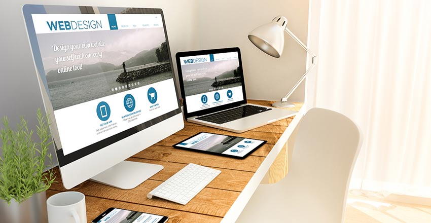
The focus on mobile optimization has dominated the web design trends in the latter half of this decade as web designers started to emphasize on creating websites that would be suitable for a varying range of screen sizes. The responsive designs that websites now have are no longer a passing phase, they are a must.
Occasionally you will still see eye catching elements in web design but that is battling with the more minimalist design sensibility over the past couple of years. One prominent entry into the scene is the aspect of endless scrolling. This has allowed web designers to practice more freedom in their layouts that incorporate everything from text to graphics and images.
The Future of Web Design
With better user experience always being strived for, immersive web design trends are evolving. There is no certainty about where the website design trends will go on from here but there is one thing for certain: Web design trends are going to continue emphasizing on mobile optimized layouts however they proceed.


