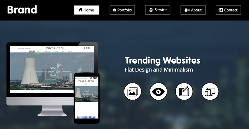
The latest trend in web design is minimalism and flat design. By “flat,” we mean plain, unadorned buttons, links, and menus. No raised edges or drop shadows, no fancy borders or glassy icons. If your forms on your site look this way, congratulations – you’re part of the latest hip design trend! But you have to be careful not to chase away customers when you simplify the visuals too much.
This article at A List Apart talks about just the sort of case we’re making here. For instance, they use the example of two actions on a form, ‘submit’ and ‘cancel’, which look identical. But to someone in a hurry who doesn’t want to think too hard, making the two visually distinct by giving the default action a different color will give them that small cognitive nudge.
True, you don’t want to distract the user with a bunch of noisy whistles and bells. But, as that article is pointing out, we might have swung too far the other way, until we’re taking information away from the user. We should always remember, particularly with doing business on the web, that making the process as easy and quick to navigate as possible helps increase conversions.
Another example used there has a function in a flat bar, as opposed to a rounded oval box that makes it obvious that it’s a button. Once again, we provide just that light cognitive nudge as a cue to the user on what to do. This is especially helpful on the mobile platform, where precise mouse actions are replaced with big, clumsy finger swipes. Giving the user a better target helps them aim for the right action.
One key test is to try using a form on your site yourself. If you can see where somebody would possibly get frustrated using it, it’s a good idea to consider getting it changed.


