
 Any business which has an online presence will almost certainly do so using a website. With so many templates now available you could literally have one up and running in a day. However, contrary to the mantra, ‘build it and they will come’, without an effective design, proper website development, and conversion factors addressed, you will struggle for traffic. More importantly, any traffic you do get, will not take the desired actions you hope for.
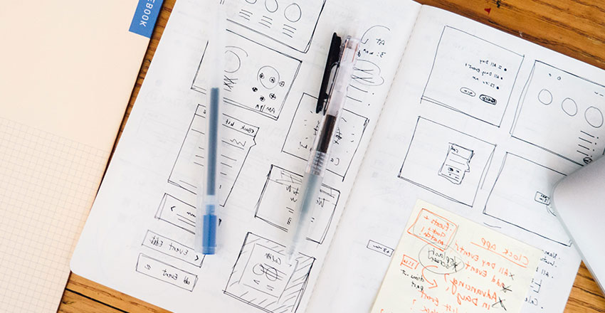
Web design and development consist of a multitude of principles and best practices, which sadly all too many businesses are unaware of, or simply do not know how to implement. This is why using a website development company to build or redesign your website is almost always the best route to take.
One of the most important reasons is that they will be up to date and fully aware of the current best practices and guidelines, especially as they apply to SEO and ranking on Google. These guidelines could literally take up an entire book, however, there are some that take precedence.
1. Keep It Simple: Less is More
Case Study: Google’s Homepage Design
One of the most common mistakes made by a business is that the more so-called bells and whistles that their website has the better. Sadly, there are many website designers who think likewise. While complex designs, animations, and excessive functionality might appeal to some, they tend to confuse the users and make the site load slowly.
Google’s front page is a profound embodiment of simplicity in web design. Its design is straightforward, consisting mainly of a search bar and limited navigation options. It is fast, clean and user-friendly.
This means that simplicity is key. Straightforward navigation, clear layouts, and clean designs are what users prefer. The page needs to have the least number of distractions possible, so users have an easier time finding or doing what they need.
To reinforce the idea of simplicity, attempt to reduce the number of options offered to the customers. The more decisions your visitor has to make, the less they like it, and the longer it takes for them to make any, which equals fewer conversions.
2. Site Speed is Critical
Case Study: Amazon’s Revenue vs. Site Speed
One of the quickest ways to ensure you lose potential customers is by having a slow-loading website. Statistics suggest users leave a webpage if it takes over 3 seconds to load.
Amazon found that they lost 1% in revenue for each 100-millisecond delay in loading time. That translates to millions of dollars in lost sales on a yearly basis.
What’s more, site speed is also a major factor in Google SEO. If your website is slow, then the users would bounce back from your website, and this would show Google that users are not satisfied with your website which would eventually lower your ranking in search results.
To make sure that your website has a fast loading time, focus on:
- Optimising images – By using image editing software like Photoshop, you can resize and compress images with no loss of quality to reduce their file sizes. Additionally, instead of JPEG, PNG, and GIF, use a file format like WebP for a lower file size.
- Using CSS Sprites – To avoid loading multiple images, combine them into one CSS sprite with an image manipulation tool or sprite sheet packer. The next step would then be a CSS to tell the browser what portion of the sprite should be displayed for a given area.
- Using Lazy Loading – Ensure that the content visible on the user’s browser is loaded first.
- Using Lightweight Plugins – Opt for lightweight and well-coded plugins that serve more than one purpose. Deactivate any unnecessary plug-ins, obsolete programs, or plug-ins with duplicate functions.
- Using a Content Delivery Network – A CDN stores copies of your web files around the world so that whenever a user visits your page, his browser can download it from the nearest data centre to him.
- Minimising HTTP Requests – The greater the number of HTTP requests, the longer it will take to load a page. Eliminate all non-essential or non-value-adding page elements.
- Leveraging Caching – Store frequently used data for faster retrieval the next time the same user visits your website.
- Choosing a Reliable Hosting Provider – A sluggish server can hinder performance so choose wisely when it comes to your hosting provider.
Apart from enhancing the SEO rankings of your website, a faster site enables better user retention and increased engagement which leads to better chances of conversion.
3. Scrolling is Better Than Clicking
Case Study: Apple’s Product Pages
A well-structured website should allow users to easily access information without excessive clicking. Modern UX research suggests that long, scrollable pages are more effective than breaking content into multiple pages requiring frequent clicks.
Apple’s product pages are an excellent example of scroll-friendly design. Instead of making users click through multiple pages to see features, they use seamless scrolling to highlight product benefits, technical specifications, and customer reviews—all on one page.
When users are forced to click through several pages to access the information they seek, they often become frustrated and leave. Alternatively, a scrollable layout minimizes disruptions, pulling them into the content more easily.
This is key for mobile as mobile users prefer scrolling over tapping to go through multiple pages. To make the experience even better, include sticky navigation and anchor links to enable jumping to key sections.
4. Use Visual Pointers to Direct Attention
Case Study: Dropbox’s Homepage Design
If you wish to encourage your web visitors to pay attention to certain areas of your site – like a sign-up form, promotional offer, or other call-to-action button – you can use visual elements with strategic intent to get them to pay attention.
For instance, Dropbox has great usage of visual hierarchy to direct the users. On their homepage, you can see the large blue button CTA on the top on a white background. They also employ indicators, like arrows and implied movements, guiding users to the primary products of the site.
A few tricks that help are:
- Directional Cues – Arrows can help direct users to where a call to action, form, or important content is. Similarly, if you use an image of a person looking at a certain part of the page, the reader will naturally follow that line of sight with their eyes.
- Contrasting Colours – Use an eye-catching colour to draw attention to the buttons or the key parts of your layout. Gradients and shadowing can also help you create a subtle visual hierarchy and focus attention on some areas.
- Motion and Animation – Whenever a user places the cursor over any element and it changes colour, size or effect, it can help indicate its importance.
- White Space – Leave space around essential elements to lead the eye easily to it. You can also get rid of some non-essential elements from your layout to have less distraction.
- Typography and Text Formatting – Use larger font size, bold, or colour changes for important text in order to give it visibility. You should also take into account the textual hierarchy, where the headline would be larger and the body text would be small yet still readable. Highlighting or underlining important pieces of information is another thing you can try.
- Framing Elements – Highlights CTAs or important information by putting them into a box or bordered element with a contrasting background colour. Spot effects such as darkening the background surrounding a form can also help ensure users stay focused.
- Repetition and Patterns – If any CTA is present in more than one place, use consistent design and colour throughout the website to register its priority. Choose common icons as they allow users to navigate easily, such as a shopping cart icon to visit the checkout and so on.
- Urgency and Scarcity Cues – Limited-time offers with countdown timers create a sense of urgency and draw attention to the pitch. Indicating that there is limited stock left also grabs attention quickly. Utilise fear or missing out (FOMO) messages like “Join 10,000+ happy customers” to create social proof while directing attention.
By subtly directing the user’s attention, you increase engagement and conversions without disrupting the user experience.
5. Use Social Proof to Build Trust
Case Study: Airbnb’s Review System
People are more likely to trust and engage with a website when they see evidence that others have done the same. This psychological phenomenon—known as social proof—can significantly influence buying decisions and user actions.
Airbnb leverages social proof by showcasing customer reviews, ratings, and real photos from past guests. This instils prospective guests with confidence that they are booking with a reputable host.
Different types of social proof that are effective include:
- Customer Testimonials – These are short, authentic quotes from happy customers. You can also add customer names and photos (with their permission of course) to give it an extra stamp of approval.
- Case Studies and Success Stories – Showing how your product has helped someone, in particular, leads to a more peer-related story. Present before-and-after results to show tangible impact, along with data, graphics and first-person quotes.
- Reviews and Ratings – These are star ratings and text reviews from Google, Yelp, or Trustpilot.
- Trust Badges and Certifications – Display security seals, payment provider logos, compliance badges, industry awards, or association memberships.
- User-Generated Content – Display customer reviews, pictures, or social media posts.
- Social Media Proof – Display follower counts, likes, shares, and engagement numbers. You can also embed social media feeds or trending hashtags.
- Media Mentions and Press Features – If you’ve been mentioned by well-known publications, you can add their logos with something like “As seen in Forbes.” You can also showcase articles, interviews, or news stories featuring your business.
Incorporating social proof throughout your website reassures visitors that they are making the right decision by engaging with your brand.
Final Thoughts
Website design goes far beyond aesthetics—it’s about functionality, user experience, and conversion optimization. By implementing these five highly effective design principles, businesses can create websites that not only attract visitors but also keep them engaged and drive them to take action.